PLANES OF PLANES, PORTLAND
INTERNATIONAL AIRPORT CONCOURSE D, FEBRUARY 16, 2016 – FEBRUARY 16, 2017

Planes of Planes at Portland International Airport, 2016.
Planes of Planes is an emotive expression of place created by Portland artist, Sara Sjol. As inspiration for this project, Sara spent hours at PDX observing travelers, watching planes land and depart, and thinking about her own experiences of flight.

Artist Sara Sjol and Planes of Planes
From bottom to top, the three 42″ x 120″ panels are titled, “Taking Off”; “Fly-over States”; and “Here We Go Again”. In creating her work, Sara considered the passengers, but also the pilots, flight attendants, airplane mechanics, and other internal staff that ensure these flights happen safely, again and again.
Sara is no stranger to creating work inspired by place – or even other art. In 2014, Sara was selected as Artslandia Performance Annual’s Cover Artist. She was also featured in the magazine. Artslandia tasked Sara with a special assignment: see three performances (music, theater and dance), paint a piece inspired by each, and then blend those pieces into a painting that would grace the cover of the 2014-2015 Artslandia Arts Annual.
Sara explains, “I have always looked at the world through my own lens. I was first intrigued with graphics — shapes, squares, patterns, and form which lead me to countless creative endeavors. My technique evolved organically. From pattern and line doodles in notebooks, to some ink and watercolor experiments on a left-over piece of screen printing paper, to the paintings I am doing today.”
Sara is also founder of The Recycled Rain Project; a Portland-based non-profit that curates a juried art show featuring new works created by incorporating rainwater. Each cycle features different local artists, with a percentage of sales donated to water-related charities. – PDX Art Blog
COMMON THREADS
GALLERY 903 / APRIL 2016
In April of 2014 we met in person for the first time to discuss the collaboration. After that meeting we had a basic concept in mind and knew what the dimensions would be. In the fall of 2014 I began creating panels for Luke. In January 2015, I went down to Los Angeles and delivered Luke 9, 29″ x 40″ panels (3 red, three yellow and three cyan) totaling 10,440 sq inches of paper. The result was our Common Threads


ARTSLANDIA ARTS ANNUAL + SMARTCAR
COVER ARTIST 2014 – 2015


In 2014 Sara was selected as Artslandia Performance Annual’s 2014 - 2015 Cover Artist.As part of the process Sara attended performances of music, dance, and theater. After each performance she created a piece. Each work then informed the final cover inspiration.
In 2015 Artslandia was approached by Mercedes of Portland to create work for a Smart Car Art Car. The cover image of the annual was chosen and made into a wrap for Artslandia’s very on SmART car.

CONFLUENCE OF THOUGHT 29” x 40” / Watercolor + Ink
2014 / 2015 Artslandia Cover – Inspired by Music, Dance and Theater
Throughout these studies I was repeatedly reminded of how much art influences art. Each piece came out completely differently, with its own palette, movement, and feel all based upon the works that influenced them.
From these experiences I combined some of the most influential moments to create one large expression of thought. I was inspired with lines by the playful movements of Strauss’ music and tension in the play Jitney. The striking color from the set of BodyVox completed the visual influence.
I found that the experience was just as crucial to the way I felt about these works – perhaps even more so. Each performance I went to was an artist’s interpretation of another’s art. This made me appreciate this cycle of artistic expression. How the confluence of many ideas come together and then are repeated and morphed with the influence of the next artist, continuing the cycle of creative thought.
This Confluence Of Thought is critical to the functioning of a creative community. I am grateful to live in a vibrant city like Portland, where I can constantly be part of the creative flow. The story above and the descriptions of the other works that follow are about is what inspired me to make these pieces – that’s what I see. While I share a lot about the origins of my work, I like to encourage everyone to find their own dialogue with each piece.

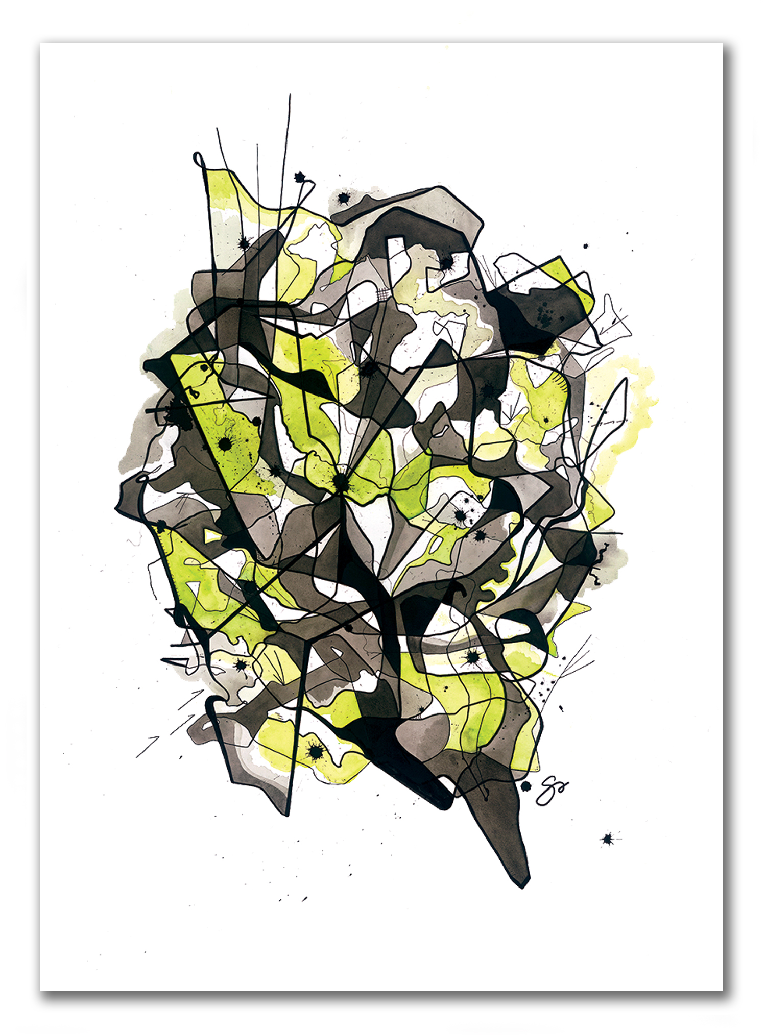
COMPLICATED 29” x 40” / Watercolor + Ink
Strauss’ Burleske – Oregon Symphony Featuring Emanuel Ax
Emanuel Ax seemed to enjoy playing the piece, especially the flourishes he played all the way down the piano. Those moments reminded me of steps – and you can see them in the piece. I listened to a performance of this online about 25 times to really get a feel for the music and I also looked up a bit of background about the work.
“The work’s original title was Scherzo in D minor, and it was written for Hans von Bülow, who had appointed Strauss assistant conductor of the Meiningen Orchestra. However, von Bülow considered it a “complicated piece of nonsense” and refused to learn it.” The fact the original work was not well received, and especially how Strauss kept changing the work, was very relatable to me as an artist. It’s hard when you are creating something for someone in particular and they do not see (or hear) what you do.
I found the work very dramatic, up and down and very abrupt in places. As soon as it starts to flow (the bluish areas in the painting) It gets stopped by a strong entrance from either the piano or another part of the symphony – hence the bold line. There are some puckish, playful moments as well. Those are represented by the yellow that is sometimes locked in, and sometimes roams free. The black always adds structure to my work. The use of the ink in this piece helped define the pockets of music contained in this piece.
I like that von Bülow considered it a “complicated piece of nonsense.” Although Strauss did revise the work by the time I heard it, I am reminded that the most challenging things often require deeper examination.

ONE MAN'S TRASH 29” x 40” / Watercolor + Ink
August Wilson – Preformed by Portland Playhouse
It was difficult to encompass such a long-form medium as a play. Was there a moment, a theme, a style? I had no idea what was going to come out as I started this piece. As with many of my works I had to go on faith that I will discover what I am looking for as part of the process.
The play was performed to perfection – filled with tension and emotion. I was a little concerned about how to portray such an intense work. The playwright, August Wilson, created a series of plays called his Pittsburgh Cycle. Jitney is about a group of independent taxi drivers in the 1970’s. Regular cabs wouldn’t go to the Pittsburgh’s Hill District so these independent drivers provided taxi services for the city’s black community.
Becker is the man in charge of the car service. He is facing the possible destruction of the building to make way for new development – leaving himself and all the other cabbies without a garage. To add to the tension, Becker’s only son has just been released from prison and tries to reconnect with his father. I started with color. I wanted to grab the color of the scene and the era – the rust on an old green Oldsmobile, the oil stains on a garage floor, the grimy color of a linoleum floor and the light sky in the background – symbolizing hope. The lines are loose and somewhat angry. I really wanted to show the tension that was felt throughout the play. It took a while for the form to take shape, but as soon as I saw a building in the lines I knew where to take the piece. It was Becker’s place.
POSSIBILITY OF PAIN 29” x 40” / Watercolor + Ink
BodyVox Dance – Music by Trent Reznor and Atticus Ross